About
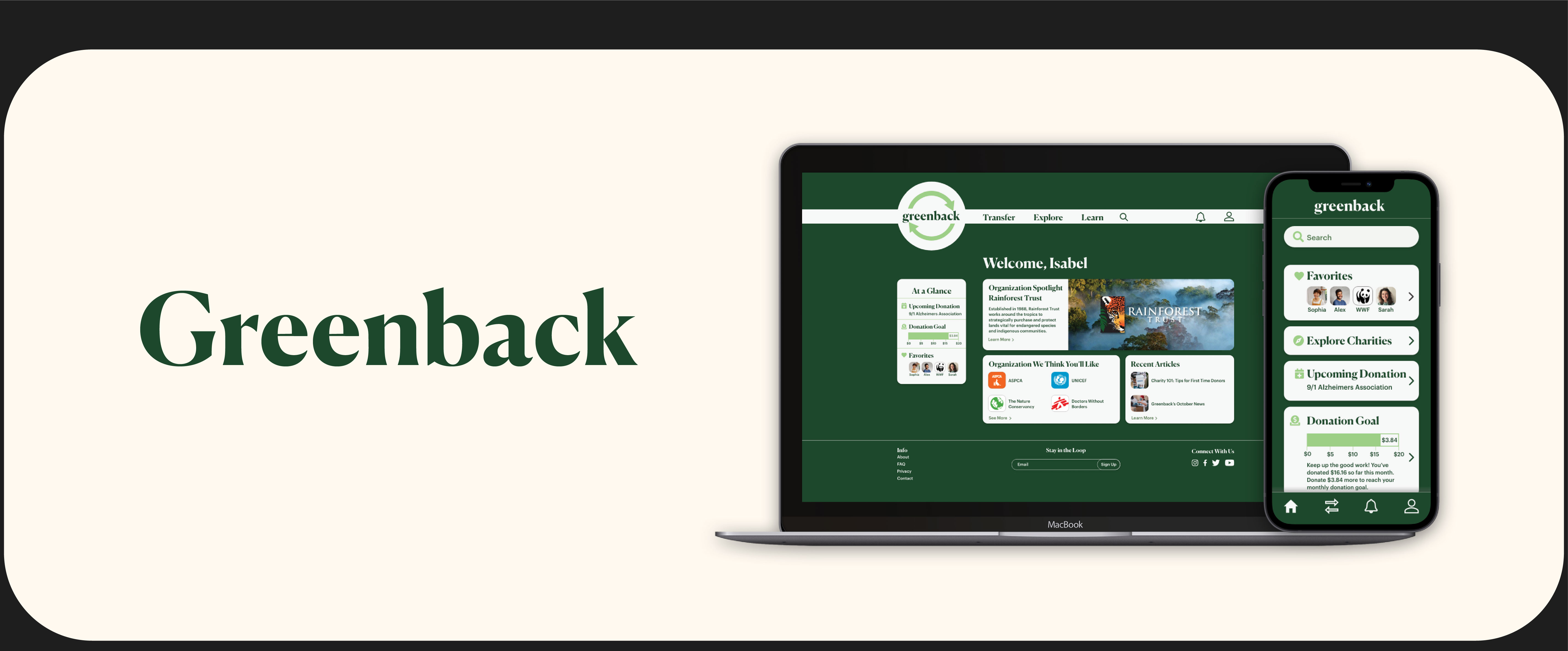
Greenback is a money transfer app with a focus on charity. With the app users are able to send, receive, and donate money all in the same place. Greenback aims to make donating to charity more accessible to those who don’t know where to start with donating and can be used to donate any amount of money, big or small.
Problem Statement
Greenback users need a way to make donating to charities easier and more accessible we will know this to be true when users donating regularly.
Research
I began researching my potential users through surveys and user interviews to gain insight into how people send money and donate.
Survey
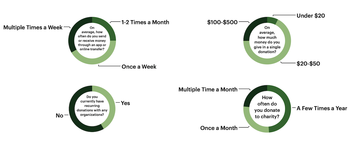
I surveyed 19 people regarding their money sending and donating habits. Here is the breakdown in responses from key questions.
User Interviews
After collecting initial survey information I interviewed 3 people to dig deeper into their habits. Here are some of the main insights I gathered.
- People want a streamlined process of sending money so it can be done quickly.
- People do like to donate money regularly but often like to have freedom to donate to different organizations.
- Having the option to round up your payment to donate to charity would be a great option to have.
- Being able to learn more about an organization before donating is a good way to make people feel confident in their donation.
Ideation
After gathering information on my potential users I started organization the structure and flow of my product.
User Flows
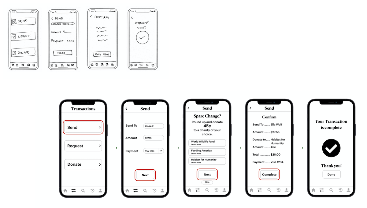
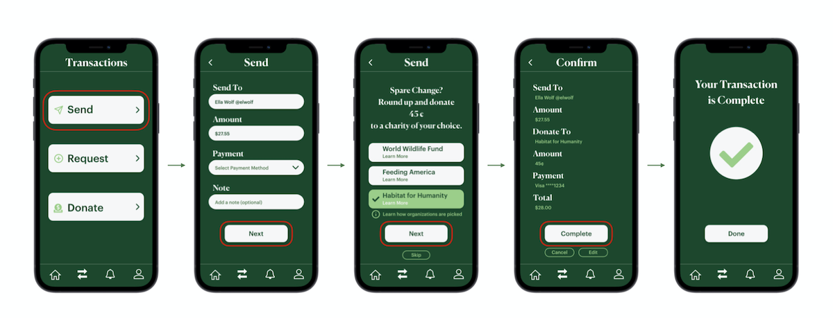
Send Money & Round Up to Charity

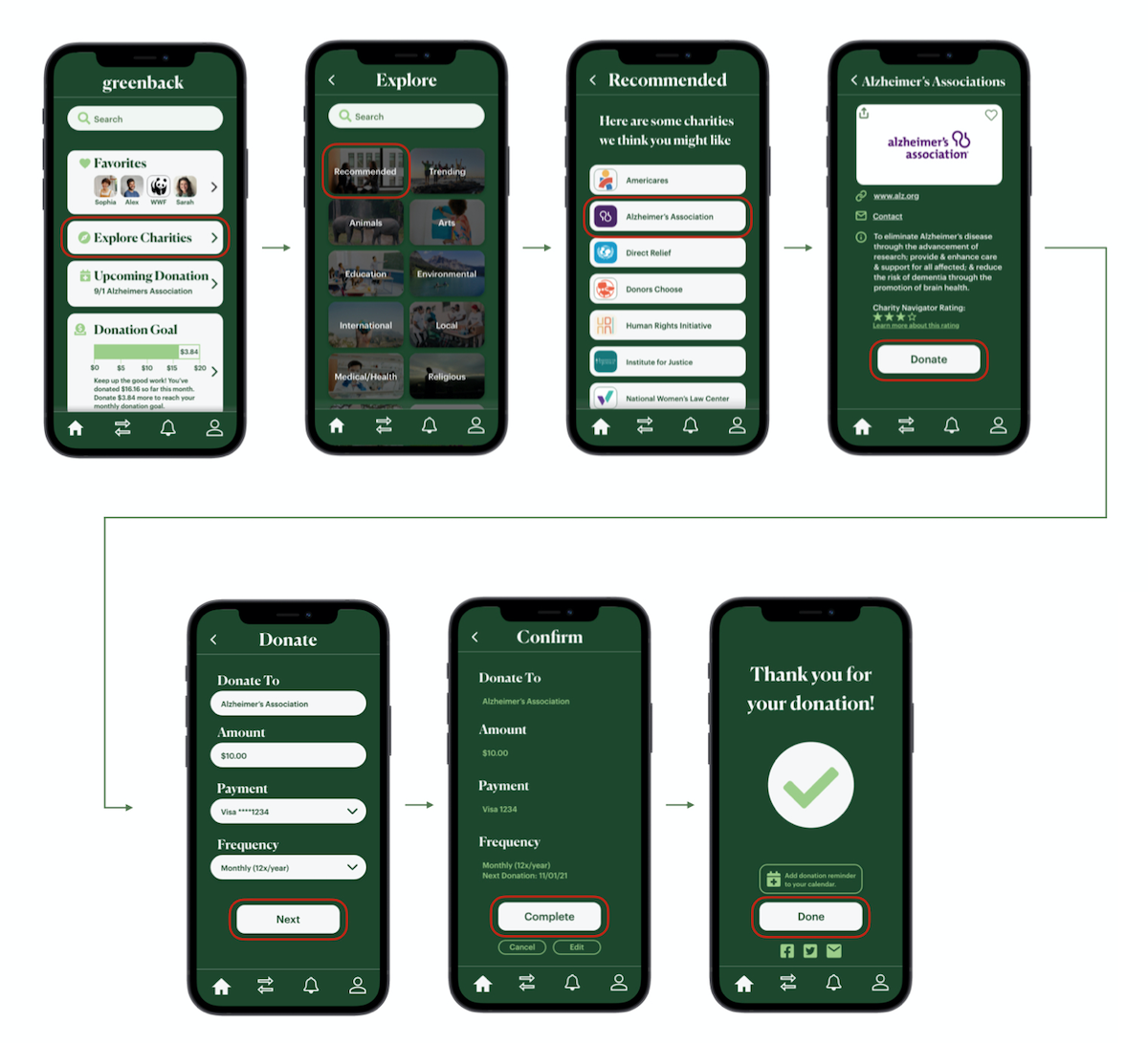
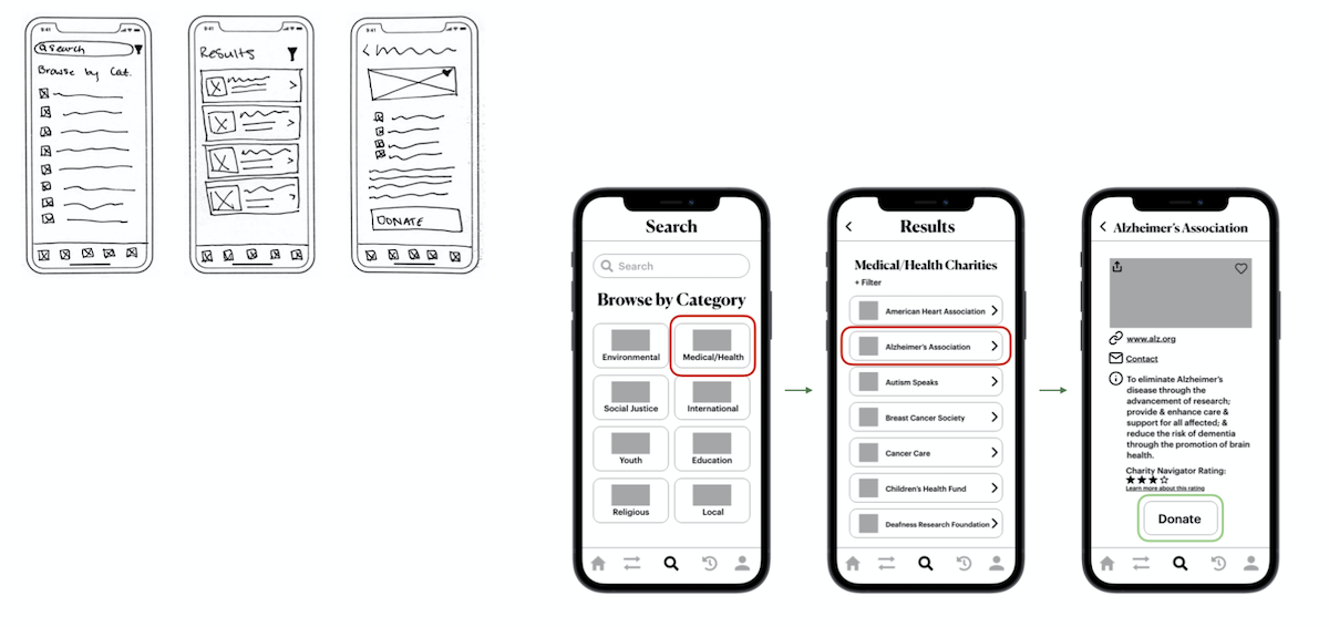
Explore Charities & Donate

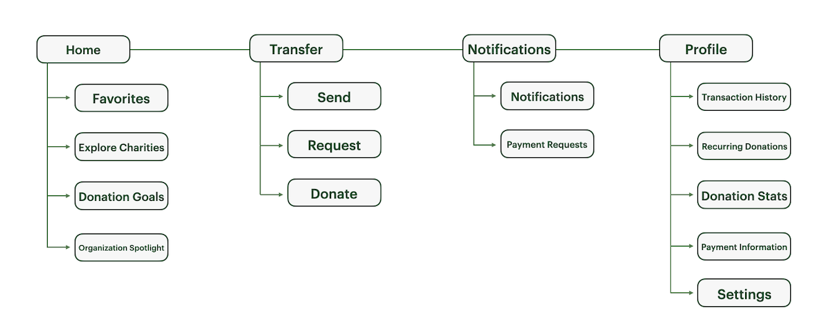
Site Map
With my user flows in mind I began to layout the structure of my product.
Low and Mid-Fidelity Wireframes
After honing in on my users and their goals I began creating wireframes. I started with low-fidelity sketches to allow me to create many different mockups quickly before landing on my initial layouts and then translated them into the first iteration of mid-fidelity wireframes.
Sending Money
Explore Charities
Iteration
I began user testing some of my designs to see how users responded to the designs and where improvements needed to be made.
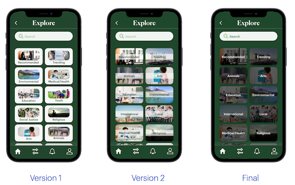
Explore
In Version 1 users felt like the photos felt cramped in the space so I updated it to fill the whole box for each category. I was pleased with the improvements on this version but found upon additional testing that the text was hard to read and needed better contrast. That is how I landed on my final iteration.
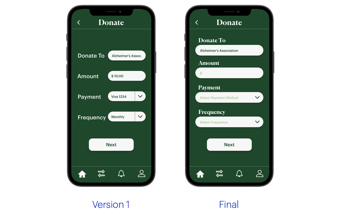
Donate
Users felt that the input fields on the donation screen were too tight, I updated the screen so the input fields that span the width of the screen for a much cleaner look.
Final Design
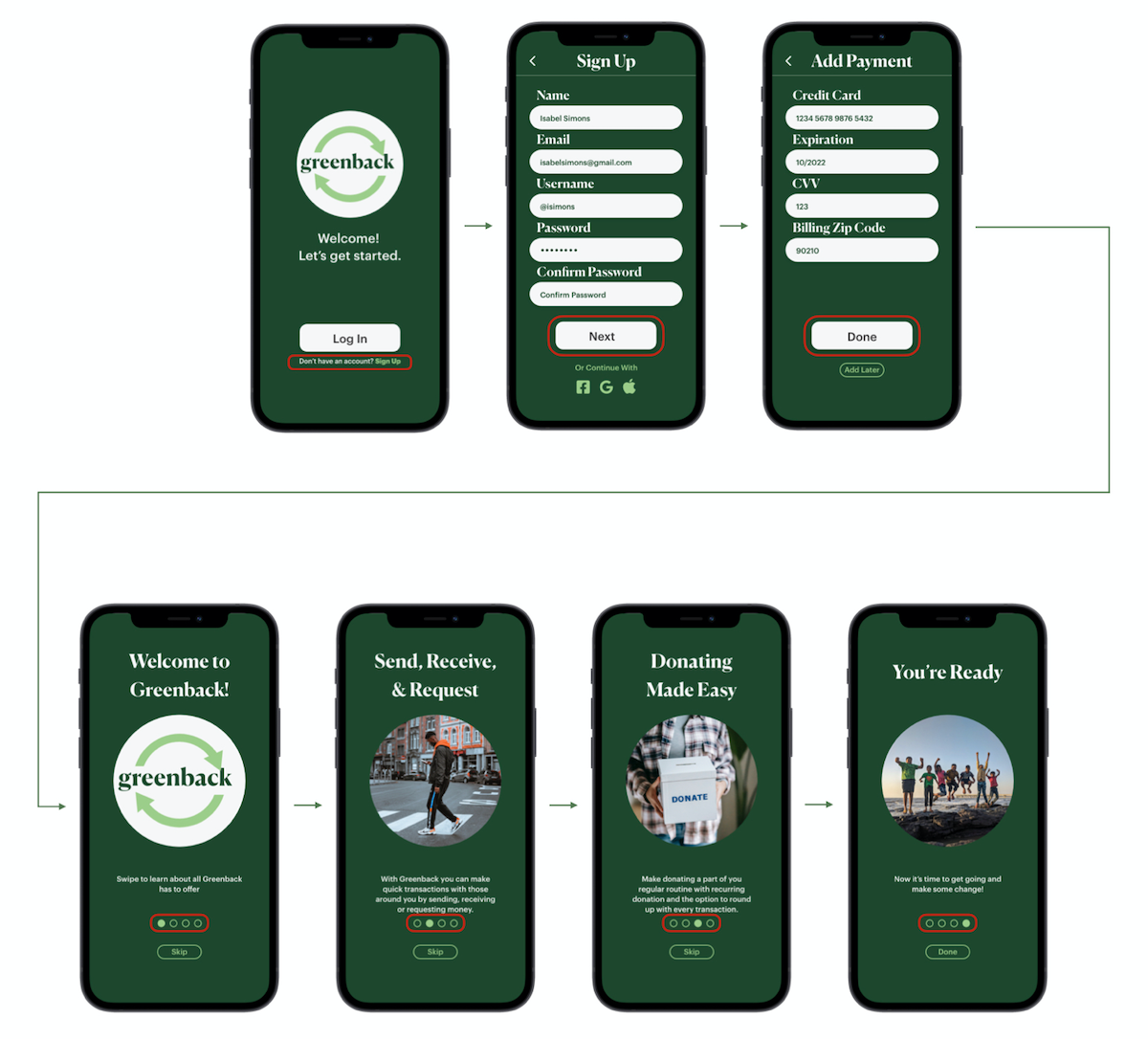
After much research, testing, and many iterations I landed on my final design.
Onboarding
Send Money
Explore Charities & Donate
